The Color of the Year phenomenon is more indicative of the last seven years of design trends; effective chromaticity is what’s important.
Pantone recently named marsala the 2015 Color of the Year. As with every year, you can expect to see an equal number of designers rush to start incorporating The Color of the Year their work, or loudly decrying why Pantone got it all wrong. The truth is probably somewhere in between. Color trends typically emerge in high fashion, trickle down to automotive colors, into graphic design, through commercial products, and then into department stores and residences, making twists and turns all along the way. Color is one of the most powerful tools in the designer’s toolbox so, theoretically, we are highly effected by these trends.
But it is more complicated than that. Designers like fashion: We study sartorialism in design school. We all check out each other’s work, so we’re certainly not immune to trends (dig out your very stark gray portfolio from the ‘90s if you need to verify this.) Manufacturers also follow trends and since we specify the products they sell, we follow their leads de facto. Some influence is inevitable, but the current popular colors are just one parameter a designer needs to navigate.
Most designers who effectively use color strive to create a mood that is somewhat independent of the current “hot” color. If you want drama, we’ll go for high contrast; if you want something more calming, we’ll limit our colors to narrower values. Reds and oranges create more psychological energy; blues and greens are more meditative. We can vary our hues a lot to create richness or limit them to a narrow band to create a more serious environment. Should we balance hues to create harmony or throw more weight to one side of the color spectrum to create a more elevated mood?
In addition, most clients bring some requirements with them in the form of branding colors, corporate graphics, or even the CEO’s favorite color. It is often the case that we need to incorporate brand colors as the base for our design, or at least use colors that don’t argue with the brand colors too much. Is this starting to sound complicated yet?
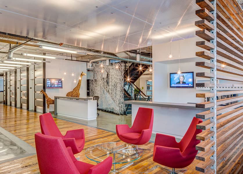
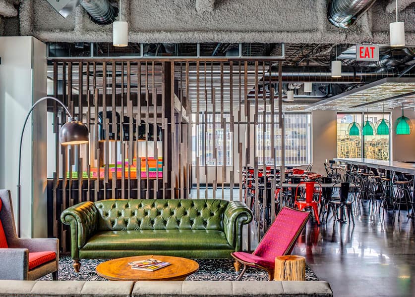
There is more: We haven’t touched on texture and pattern yet. The exact same Marsala has a very different feeling if it’s polished and glossy, or woolen and nubby. Do we use it in a large, graphic pattern with a white background to achieve drama, or make it a textured solid to create a giant wash that is a little more “timeless?” And what about placement within the space? A Marsala ceiling might be oppressive, but as a floor covering it might ground the area.
These are just a handful of considerations that designers must think about on every project, and mastering them is possibly the difference between a good design and a great one. Based on previous Colors of the Year, you can probably expect to see marsala show up in the design magazines within the next few years, but color trends are only one factor in a long list that contribute to a successful design. Color psychology, contrast levels, and balance are all just as important as what color is hot right now.
So how will this play out in 2015? I think we’re trending toward slightly warm neutrals; browns are mostly on hiatus and wood is getting stained gray and black. Drama, expressed as contrast and juxtaposition, are big players right now, so we’re seeing lots of authentic materials next to shiny synthetics and intense fields of color surrounded by vast neutral space. As for the colors themselves, the hot colors seem to be lightly amped-up colors from nature; floral pinks, oranges, and lots of blues, rather than more architectural primaries. Marsala, a lovely wine color grounded with brown, plays quite nicely with those other nature-derived colors, gray-toned woods, and your white denim.